.png)

.png)


.png)
Ever wonder if studying can actually be fun?
For the Nibble mobile app, we created two vibrant animations that bring the platform’s most popular topics to life. More than just colorful visuals, this project highlights the many paths users can explore — because your curiosity didn’t die. It’s just been waiting.
Watch the videos here:
Here’s how it all happened:
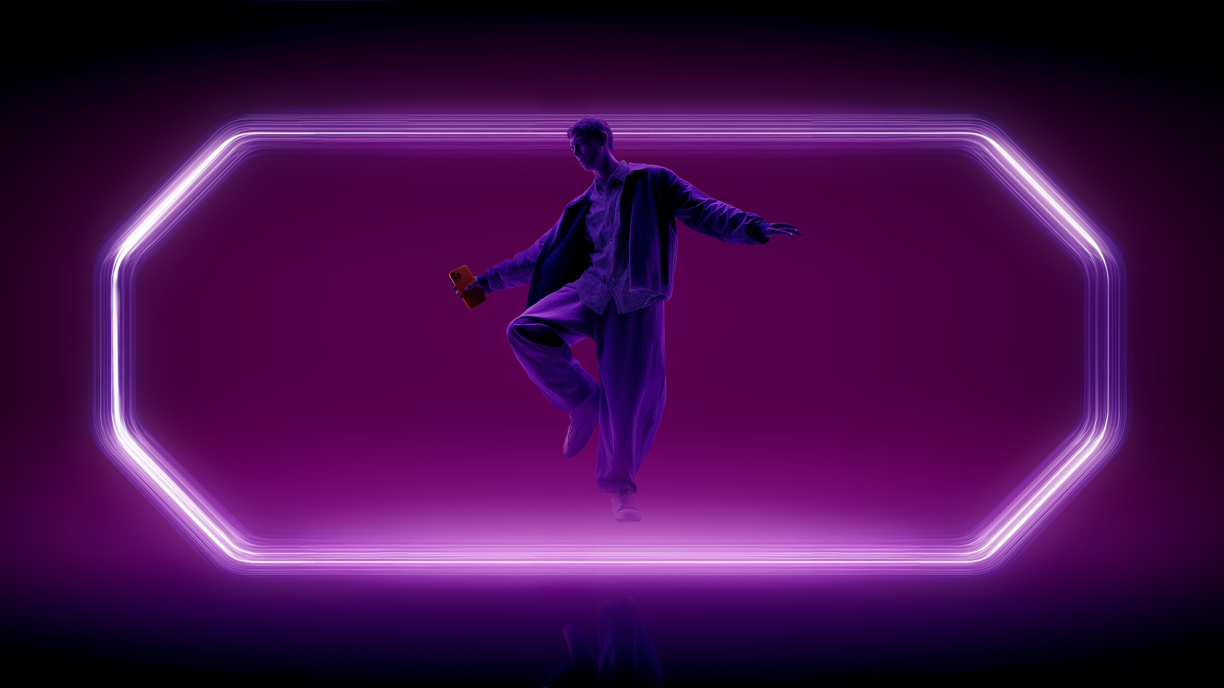
It all started with the parent company, Headway. A while back, we developed a successful launch campaign for the Canadian market featuring some pretty hilarious characters. Later, we adapted it for the US, and eventually, thanks to internal recommendations, their subsidiary brand Nibble reached out to us. We couldn't have been more excited!
The Nibble team was gearing up to launch the app in the UK. Since we weren’t active users yet, our deep dive into the product happened right alongside the creative process. The goal was to create two short promo videos to build brand awareness — introducing the app to a new audience while highlighting Nibble’s core spark: curiosity.
.png)
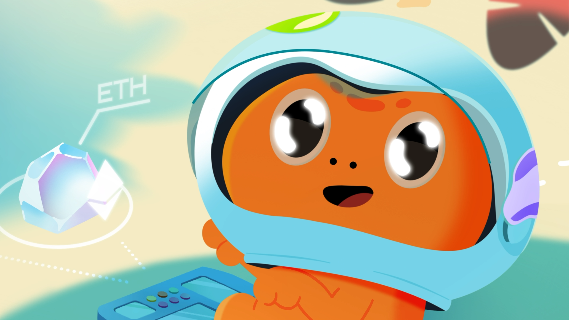
We latched onto that word and started spinning it. To do this, we dug into the app’s statistics to find the top 10 most popular topics. This led us to segment the videos for two audiences: male and female. We showcased different scenarios based on what each demographic engages with most in the app.
We really wanted to create active storytelling where the viewer travels through completely different worlds alongside the hero. One moment they’re just scrolling through the app, and — bam! — they’re inside the topic they’re learning about. Then — bam! — they’ve jumped into a new one.
Style-wise, we knew immediately we’d go with 2D animation. Nibble’s visual identity is minimalist with a lot of flat graphics. We embraced this and elevated it, even adding fully-developed characters that the brand didn't have before (but does now!).
.png)
The main challenge was fitting everything into a 15-second spot, which also had to include an intro and a packshot. That left us with just 10 "clean" seconds for our heroes' curiosity-driven journeys. According to our vision, we wanted to show three scenes from completely different fields within that window.
.png)
To pull this off, we bet on seamlessness. We used a technique where one scene dynamically flows into the next without any hard cuts. This saved precious seconds and created a "one-shot" feel. Every scene was first meticulously planned on a storyboard, mapping out the transitions to ensure they functioned as a single shot. Then came the rough animation and testing. During the animatic stage, we tried countless variations, cutting and accelerating transitions until we hit that perfect tempo.
.png)